What Should 'Cancel' Do?
Posted by Dylan Beattie on 11 July 2023 • permalinkGood user experience design is about balance. Software lives in this weird liminal space where a perfectly innocent word has two contradictory and completely obvious meanings: anybody who’s ever written a Java program to to manage school enrolment knows that creating a class isn’t the same as creating a class, but most of the time, there’s a way to get the balance right.
Most of the time.
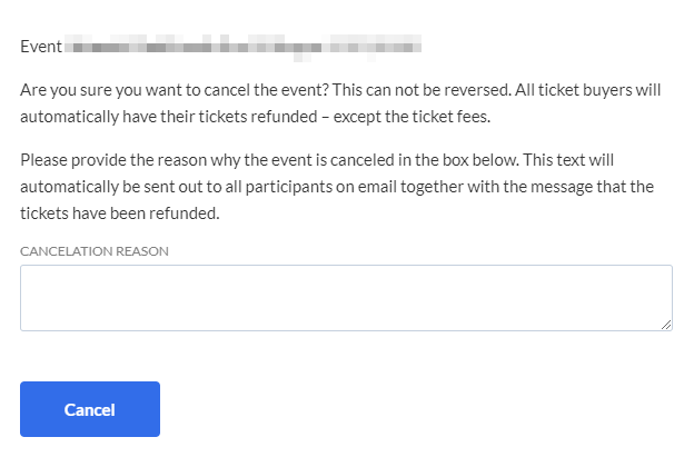
I got this absolute gem of a screen today, from some event management software I’m integrating with:
No, I’m not going to tell you where it’s from. They’re still figuring a lot of this stuff out, bless ‘em.
To be fair, if you end up on this screen by mistake and instinctively reach for the Cancel button, it won’t actually cancel the event unless there’s some text in the “CANCELATION REASON” box.
If there is? You’re one click away from accidentally refunding all your tickets and emailing all the ticket holders saying the event’s been called off.
I don’t know about you, but I’d have gone with a big angry red button labelled “Cancel This Event”, and perhaps a smaller, friendlier one labelled “Go Back”… y’know, just to make it obvious which one is which.
And, just in case you ever think the software industry is paying attention and learning from our own mistakes, here’s a post I wrote over a decade ago about SagePay doing exactly the same thing: “Should ‘Cancel’ cancel the cancellation, or just cancel the cancellation cancellation?”