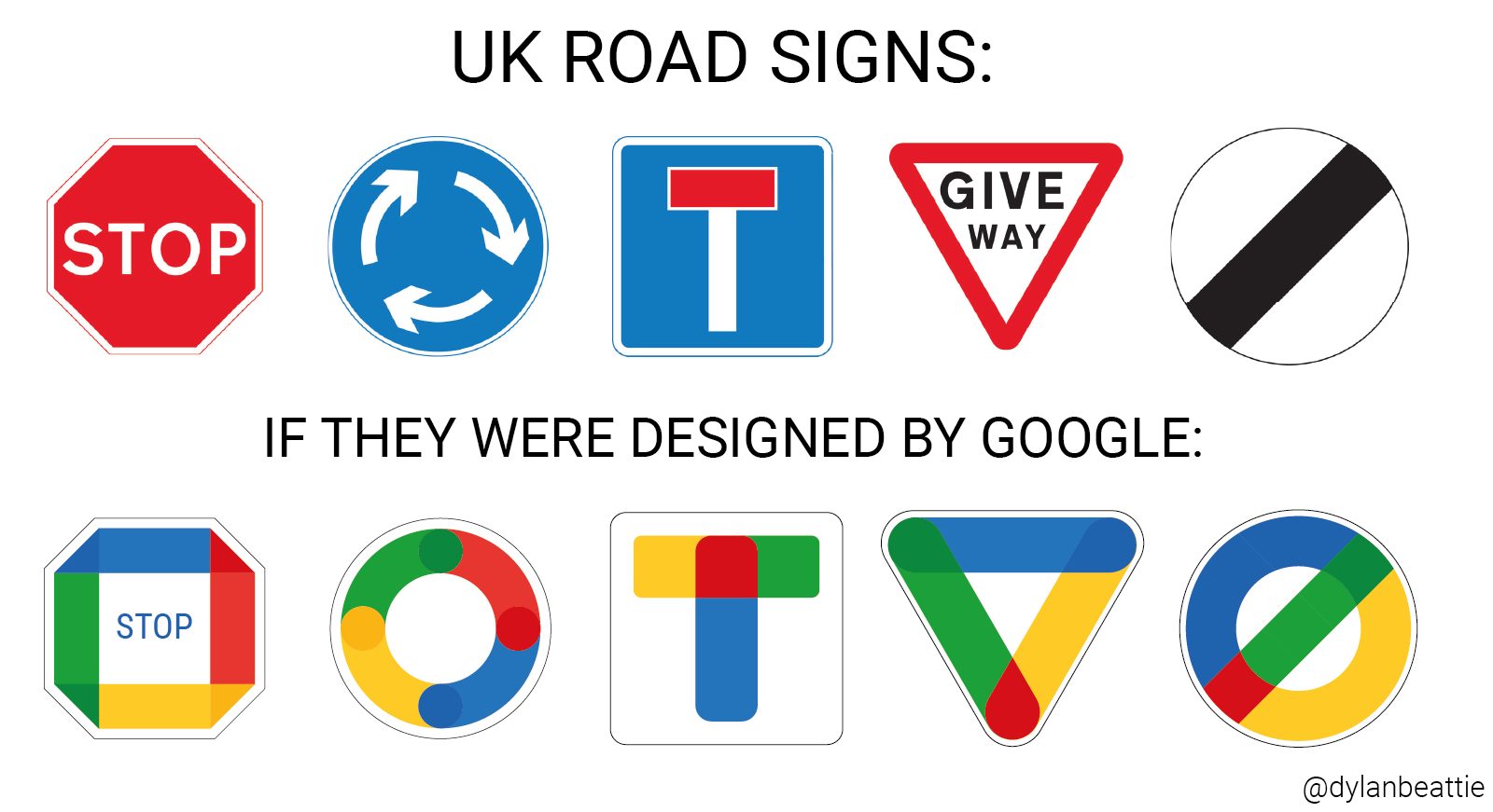
UK Road Signs (Redesigned by Google)
Posted by Dylan Beattie on 25 July 2021 • permalinkLast year, Google redesigned the icons used for many of their web and mobile apps, as part of their “rebranding” of G Suite to Google Workspace. And they took a bunch of distinctive, easily recognisable icons and… well, they kinda made them all look the same. There is a much more in-depth discussion of it over on TechCrunch, but it got me thinking: what if you applied the same idea to something really familiar? Something that millions of people rely on every day, something that hasn’t changed in decades, something where clear signage you can recognise at a glance might literally be a matter of life and death?
What if UK road signs were redesigned by the Google Workspace team?