My Life with the Microsoft Natural Keyboard
Posted by Dylan Beattie on
03 January 2017
•
permalink
A moment ago I was catching up on Twitter and I saw this:
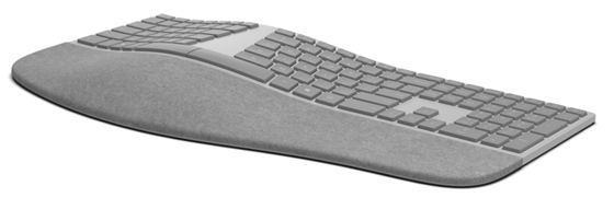
Now Scott has written some great posts about keyboards – and mice, and workstation ergonomics in general – over the years, so I immediately clicked the link to see what was so exciting… and wow. This is the new Microsoft Surface Ergonomic Keyboard, and I, too, am now sitting here trying not to buy it. Actually, I’m waiting for a UK layout, and then I suspect that trying not to buy it will rapidly become unmanageable. I may even fail to not buy two of them so I have one at work and one at home.

Now, there’s a couple of things about this keyboard that are interesting only because Microsoft have consistently got them right, and then messed them up, and then got them right again, and then messed them up again - over many, many years. Like an even-numbered Star Trek movie or an odd-numbered version of CorelDraw, this latest one is a good one – and as somebody who’s used every incarnation of the Microsoft Natural keyboard, this seems like a nice opportunity to take a little wander down memory lane.
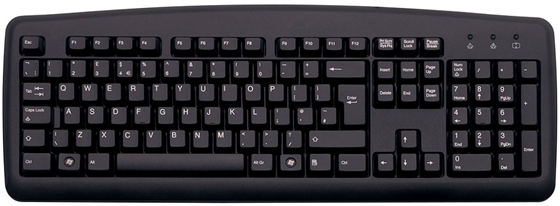
OK, cue the Wayne’s World dream-sequence time-travel effects… and here’s a keyboard. A 102-key IBM PS/2 keyboard, which was the standard layout for PC keyboards for about a decade, back in the days when keyboards were beige and the cool kids knew all sorts of tricks that would let you load HIMEM.SYS and your mouse driver and still have enough main memory left to run Wing Commander 2.
 (IBM PS/2 keyboard by Raymangold22 via Wikipedia | CC0 | Link)
Around the time of Windows 95, Microsoft proposed the subtle addition of a two new keys – a Windows key (actually two of them) in those handy gaps next to the Ctrl keys, and a key that I’ve just this second learned is called the menu key, which is basically a right-click key. Other than shortening the space bar slightly, these new keys didn’t really move things around much, which was great, because that hard-earned muscle memory that let you hit triple-key combinations without taking your eyes off the screen worked just fine.
Oh, and they also started making them in colours that weren’t beige, which was a big improvement if you actually had to share your living space with them.

It’s around this time that I left school and got my first IT job, which meant I was typing for a good chunk of every day, and within a year I started getting unpleasant pain in my wrists and forearms. During a chance conversation at work, someone mentioned that a former employee there had had the same problem and switched to using an ergonomic keyboard – which was still knocking around in a cupboard somewhere. I tried it out and was instantly smitten.
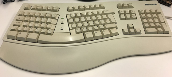
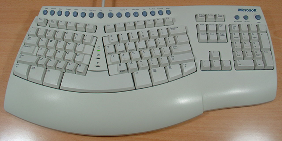
This was the original Microsoft Natural keyboard, released in 1994.
I absolutely loved it. I literally wore it out – I used it until some of the keys no longer worked, and then went shopping for a replacement… and discovered you couldn’t get the original Natural keyboard anymore; it had been replaced by the Natural Keyboard Elite, released in 1998.
Looks close enough, right? Except if you look closely, you’ll see that instead of the familiar inverted-T cursor shape and two rows of navigation keys, the cursor keys are in a sort of weird diamond formation and the navigation keys are in two columns.
This was horrible. All those years of muscle memory suddenly gone – every time you’d try to hit Ctrl-PgUp or Shift-End you’d get it wrong. And when you’re in the zone, that’s a horrible, jarring experience – every time it happens it interrupts your flow, wrenches you back to reality and makes you want to throw the damn thing across the room. Imagine driving a car where the brake pedal is above the accelerator instead of alongside it – it was a truly unpleasant experience.
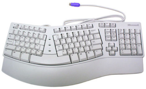
Fortunately, it didn’t take long for them to realise this one was a bit of a mistake. A year later in 1999, they came out with the Natural Keyboard Pro, and it was fantastic.
All the keys were in the right places, and it included a two-port USB hub which was great for plugging in your mouse. It added a bunch of “multimedia” buttons (which I never really used) and a dedicated button for launching the Windows Calculator (which actually proved to be surprisingly useful.) I loved this keyboard dearly. You can guess what happened next… yep, I used it until it wore out, went shopping for a new one, and… yeah. No more Natural Keyboard Pro. Instead, we had this delightful triumph of form over function:

The Microsoft Natural Multimedia Keyboard, released in 2004. OK, it’s got the classic inverted-T cursor keys (yay, but - look at that! Not only are the navigation keys all wrong, but the Insert key isn’t even there; we’ve got a massive double-height Delete key instead. If memory serves, Insert was relegated to some sort of funky combo involving the PrtSc key. Oh, and this was also the keyboard where you had to keep F-Lock switched on all the time because the function keys were actually some sort of weird keyboard shortcuts that nobody ever used ever. You know. Like a dedicated key for “Send”, because Ctrl-Enter is just too complicated.
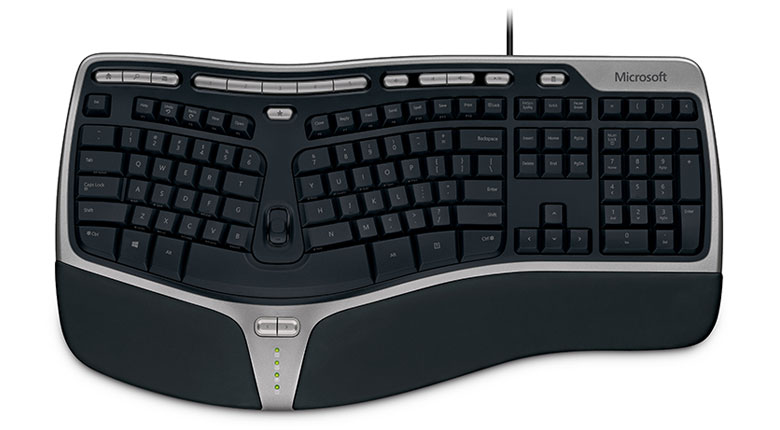
Again, it didn’t take long for them to come out with something better… and boy, did they ever get it right with the next one. The Microsoft Natural Ergonomic Keyboard 4000.
photo via microsoft.com
This was my main keyboard for most of the last decade. I loved this keyboard so much I actually stockpiled it – one at work, one at home, and a few spares standing by in case they wore out. And wear out they did, one by one, until late last year I decided it was time to replenish the stockpile… which is when my long-suffering colleagues half-jokingly asked if, maybe, I’d be prepared to try something quieter. See, the 4000 is lovely, but it’s noisy. The keys have plenty of travel, with a nice satisfying thump at the bottom of each keystroke, and the keyboard’s casing – which is big – makes a rather effective sounding-box. Until the bottom falls out of the London real estate market and we can justify private offices for our developers, FogCreek style, the open plan office is an unfortunate fact of life for most of us… and so, in the spirit of workplace harmony, I ordered a Microsoft Sculpt keyboard.
And you know what? It’s pretty close to perfect. It’s comfortable. It’s quiet. It takes up about 60% of the desk space that the old Ergonomic 4000 did. The numeric keypad is actually separate, which I’m completely undecided about… when you actually want to type on it, it’s annoying not having it fixed in place, but being able to pick it up and use it like an old-school calculator is actually surprisingly useful. Except – yep – the navigation key layout is all screwed up. Again. I hit Insert by mistake all the time on this thing, and frequently land on the left cursor when I’m reaching for Ctrl.
But with the release of the Surface keyboard at the top of the post, it looks like, yet again, there’s a truly great keyboard hot on the heels of the not-so-great one. I’m just really curious as to why they keep bringing out models that use non-standard keyboard layouts.

 (IBM PS/2 keyboard by Raymangold22 via Wikipedia | CC0 | Link)