Affordances, Signifiers, and Cartographobia
Posted by Dylan Beattie on 27 July 2016 • permalinkOne of the teams here is putting the finishing touches on a new online version of Spotlight Contacts, our venerable and much-loved industry guide that started life as a printed handbook way back in 1947. Along the way, we’ve learned some very interesting things about data, and how people perceive that their data is being used.

One of the features of the new online version is that every listing includes a location map – a little embedded Google Map showing the business’ location. When we rolled this feature out as part of a recent beta, we got some very unhappy advertisers asking us to please remove the map from their listing immediately. Now, most of these were freelancers who work from home – so you can understand their concerns. But what’s really interesting is that in most cases, they were quite happy for their full street address to stay on the page – it was just the map that they were worried about.
Of course, this immediately resulted in a quite a lot of “what? they want to keep the address and remove the map? ha ha! that’s daft!” from developers – who, as you well know, are prone to occasional outbursts of apoplectic indignation when they have to let go of their abstractions and engage with reality for any length of time – but when you think about it, it actually makes quite a lot of sense.
See, street addresses are used for lots of things. They’re used on contracts and invoices, they’re used to post letters and deliver packages. Yes, you can also use somebody’s address to go and pay them a visit, but there are many, many reasons why you might need to know somebody’s address that have nothing to do with you turning up on their doorstep. In UX parlance, we’d say that the address affords all of these interactions – the presence of a street address enables us to post a letter, write a contract or plan a trip.
A map, on the other hand, only affords one kind of interaction; it tells you how to actually visit somewhere. But because of this, a map is also a signifier. It sends a message saying “come and visit us” – because if you weren’t actually planning to visit us, why would you need to know that Spotlight’s office at 7 Leicester Place is actually in between the cinema and the church, down one of the little alleys that run between Leicester Square and Chinatown? For posting a letter or writing a contract, you don’t care – the street address is enough. But by including a map, you’re sending a message that says “hey – stop round next time you’re in the neighbourhood”, and it’s easy to see why that’s not really something you want if you’re a freelancer working from your home.
It’s important to consider this distinction between affordances and signifiers when you’re designing your user interactions. Don’t just think about what your system can do – think about all the subtle and not-so-subtle messages that your UI is sending.
Here’s the classic Far Side cartoon “Midvale School for the Gifted”, which provides us with some great examples of affordances and signifiers. The fact you can pull the door is an affordance. The sign saying PULL is a signifier – but the handle is both. Looking at it gives you a clue “hey – I could probably pull that!” – and when you do, voila, the door swings open. If you’ve ever found a door where you have to grasp the handle and push,, then you’ve found a false affordance – a handle that’s sat there saying ‘pull me…’ and when you do, nothing happens. And, in software as in the Far Side, there’s going to be times when all the affordances and signifiers in the world are no match for your users’ astonishing capacity to ignore them all and persist in doing it wrong.
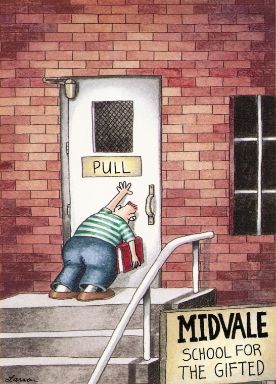 (Far Side © Gary Larson)