Iconography is Hard: VS2022 Refresh Edition
Posted by Dylan Beattie on 26 February 2025 • permalinkI’ve spoken before about the four different styles of visual communication - pictographic, phonographic, ideographic and logographic:
- Pictographic writing is where the symbol is a picture of a thing. The smiley face emoji 😃 is a good example - regardless of what languages and alphabets you can read, you’ll see that picture and think “hey, a happy person!”
- Phonographic writing is where pictures stand for sounds. It’s how most Western alphabets work - remember learning to read in school? Sounding out “r e d b a l l” until your brain put the sounds together into “red ball” and you went “oh, yeah, a red ball!”
- Ideographic writing is where pictures stand for ideas - and unless somebody’s explained it in advance, you have no clue what it means. You know the “eyes” emoji 👀 ? Does that mean “I’m watching this to see what happens?” Or “I’m looking into this for you now?” Or “I’m rolling my eyes in despair because I knew this was going to happen?” Depends on the context, culture, team.
- Logographic writing is where an image stands for a word - not an idea, but a specific word. You don’t find it much in Western languages and alphabets but it’s used in Chinese, and in kanji, one of the three forms of written Japanese: the kanji 父 represents the word “father”, for example.
When it comes to building things like toolbars and user interfaces, things can get properly gnarly. Most modern desktop apps use a delightful mashup of pictograms, ideograms and phonograms - the little yellow folder where you stored all your documents, the floppy disk that used to be a pictogram but most folks using computers today have never actually seen one so it’s become an ideogram.
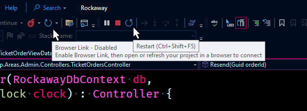
I noticed earlier today that the menu in Visual Studio 2022 has two almost identical icons on it… circular arrows, which we’ve come to associate with the idea of refreshing something (“go around again”, I guess?)
Except in VS2022, if the arrow’s rotating clockwise, it means “Browser Link”, and if the arrow’s rotating counter-clockwise, it means “Restart (Ctrl+Shift+F5)”. I guess… righty refreshy, lefty-lets-recompily?
But hey - iconography is hard. You try explaining the difference between a Browser Link refresh and a project restart in 24x24 pixels. 😉